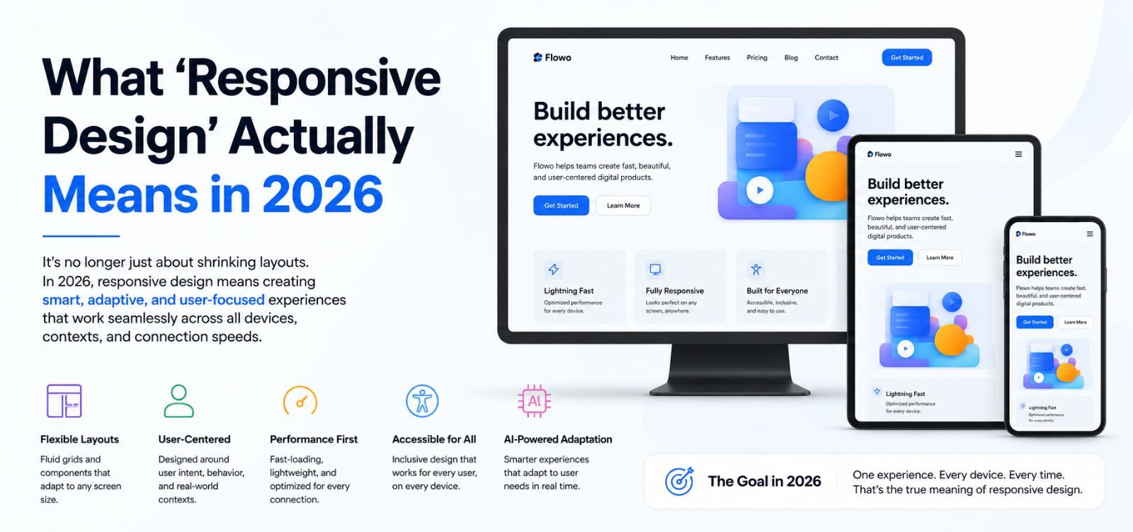
"Responsive" gets used loosely enough that it's worth being specific about what it actually means when we say a site is responsive. It's not just that the layout doesn't break on a small screen — it's that the site is genuinely usable on the devices your visitors actually use, not just the ones that happen to be easy to test on.
It's not just phone vs desktop anymore
We test across a spread of common widths — small phones, larger phones, tablets in both orientations, and a couple of common laptop and desktop sizes — because a layout that works at 390px and 1440px can still break at 768px if nobody checked the middle ground.
Touch targets matter as much as layout
A button that's easy to click with a mouse cursor can be genuinely hard to tap accurately with a thumb. We check tap target sizes and spacing specifically on mobile, not just whether the button "shows up."
Forms are where responsive design usually fails first
Multi-column forms, date pickers, and dropdowns are the most common place a site looks fine but becomes frustrating to actually use on mobile. If your lead form is annoying to fill out on a phone, you're losing enquiries from exactly the audience that's most likely to be browsing on one.
Real content, not lorem ipsum
A layout that looks responsive with placeholder text can still break once it's filled with your actual, longer product names or your actual, shorter tagline. We test responsive layouts with real content wherever possible, specifically to catch the awkward line-wraps and overflow issues that only show up with the text you'll actually be using.