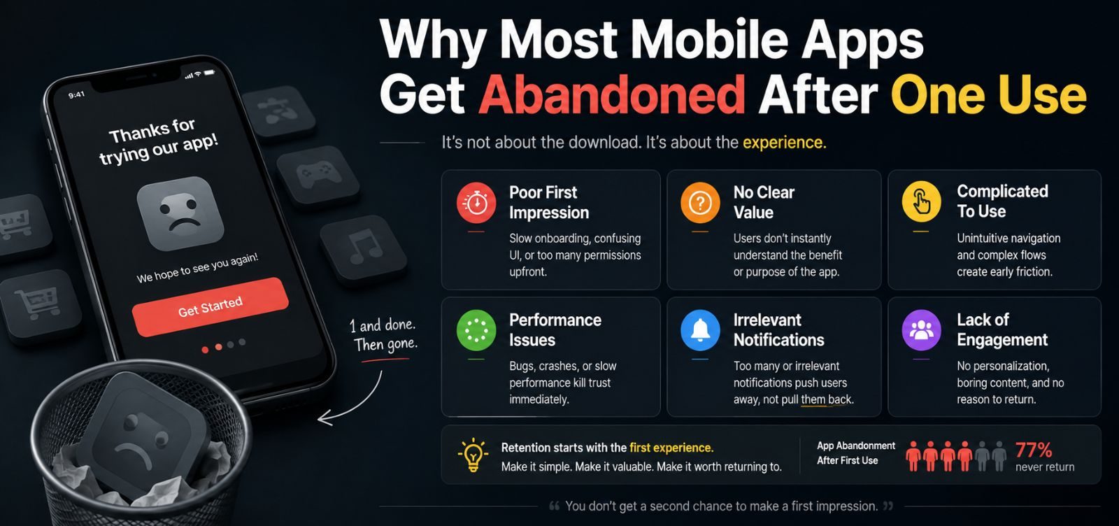
Most mobile apps don't fail loudly. Nobody uninstalls in anger and leaves a one-star review explaining exactly what went wrong. They just... stop opening it. Understanding why that happens is more useful than any feature list when you're planning a new app.
The core action takes too many taps to reach
If the one thing your user opened the app to do is buried three menus deep, they'll do it once, feel the friction, and quietly go back to whatever they used before. The home screen of your app should get someone to their main goal in as few taps as realistically possible.
Onboarding asks for too much, too soon
Account creation, permission requests, and a five-screen tutorial before someone's even seen the app work is a common way to lose people before they've experienced any value. We generally recommend showing value first, and asking for commitment (accounts, permissions) only when it's actually needed for the next step.
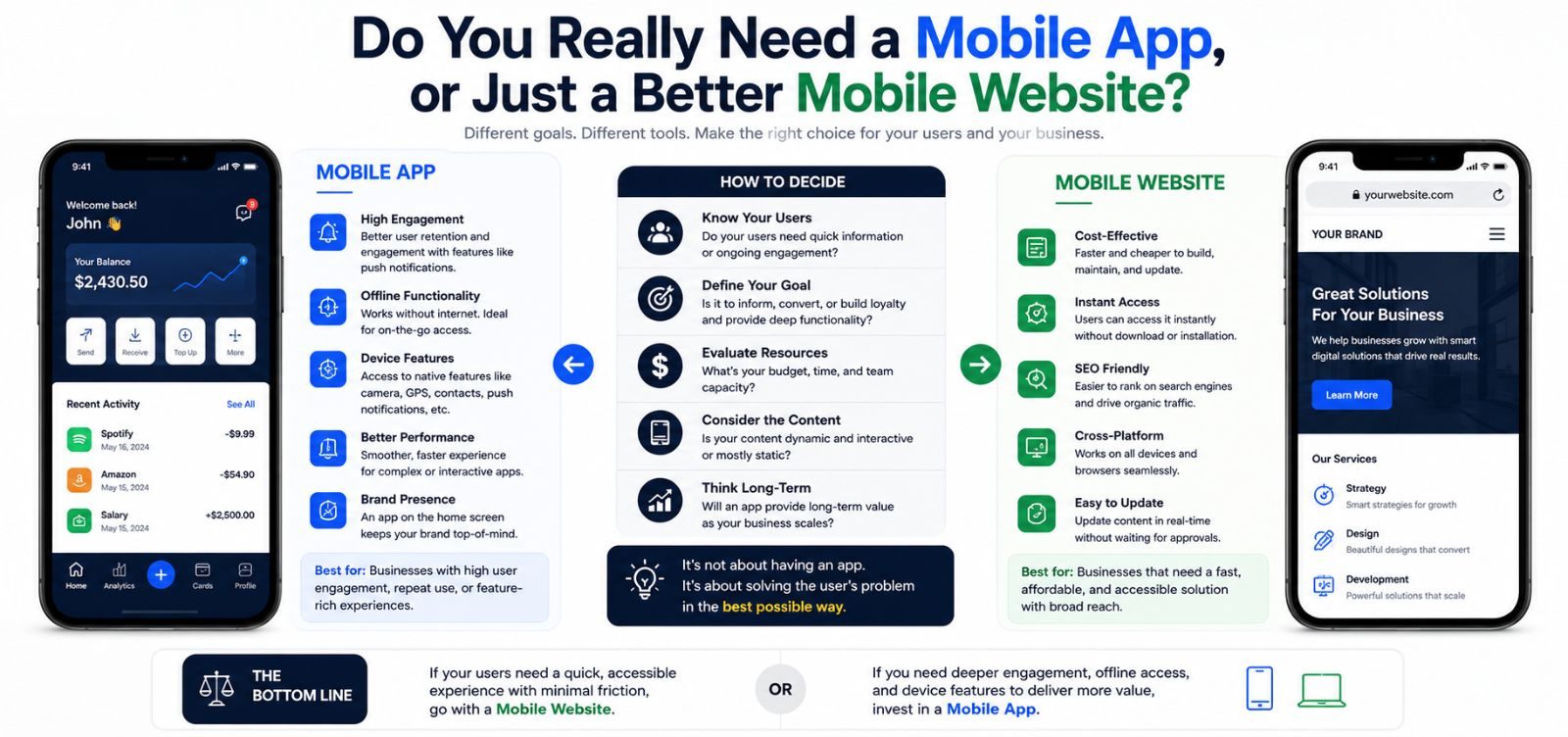
It doesn't feel different from the mobile website
If your app is essentially your website wrapped in a shell, with no advantage — no offline access, no faster checkout, no push notification value — users have no real reason to keep it installed over just visiting your site in a browser.
Designing against quiet abandonment
The apps that stick tend to do one thing very well and make that one thing fast to reach, rather than trying to replicate every feature of a full website inside a smaller screen. If you're planning an app, it's worth being ruthless about what that one core action actually is before any screens get designed.